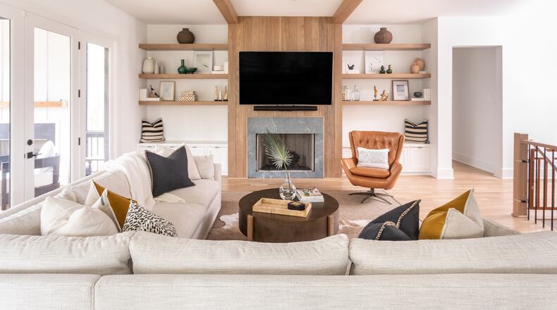
No area of the home can be as simple but also as complex as the bookshelf. It is an undeniably functional space for storage that can transform into a memorably stylish one with the right vignette of beloved books, souvenirs, artwork and objects.
Enter the “shelfie,” in which an ordinary shelf suddenly becomes special when matters of balance, symmetry and scale are addressed. And just like a mediocre selfie becomes next level when filters and editing tools are used, the shelfie is an opportunity to make your home decor something special by being strategic and intentional, making sure your shelfie shines.
“It’s a focal point, and you want to treat it like a statement in the room,” Atlanta interior designer Gabriela Eisenhart of Silo Studio Design said of the shelfie.
TikTok has recently taken note of the impact of the bookshelf in its new trending hashtag #bookshelfwealth which celebrates homes filled with books and artwork and evidence of a life well-lived.
Credit: Handout
Credit: Handout
Eisenhart recommends thinking of your shelfie in three layers. First comes the foundation — the shelf itself. Whether it is a built-in or freestanding bookshelf, here’s where you can use white for a minimalist look, a darker, trending color or even wallpaper behind your shelves for dramatic impact, Eisenhart said. The next step is layering in artwork, whether that is paintings or photographs. Step three is layering in books, which can be placed horizontally or vertically, spines in or out. And the fourth step is adding sculptural or decorative objects.
Read on for more tips from designers on achieving the ultimate shelfie and display #bookshelfwealth.
Credit: Tara Carter Photography
Credit: Tara Carter Photography
- Style your books. Eisenhart likes to remove book covers, which can be less appealing than the book itself. She also groups books by spine color to create a color-themed rainbow effect. Designer Andi Morse of Morse Design turns spines away from view to give a uniform, monochromatic look to her shelfies. Eager to display your #bookshelfwealth but don’t have time to assemble a collection? Eisenhart said companies such as Books by the Foot offer the opportunity to buy vintage or single color books for bookshelf styling.
Credit: Elliot Fuerniss Photography
Credit: Elliot Fuerniss Photography
- Keep scale in mind. Small collectibles and tiny sculptural objects can get lost on a shelf so Eisenhart advises caution in putting dainty items on a bookcase. In rare exceptions, you can play with scale by pairing smaller items with massive shelves in a contrasting color as Morse did in one Atlanta home, but that kind of styling might be better left to a designer.
- Add plants. Plants are a great way to play with scale, Eisenhart said. Smaller succulents or draping ivies and pothos can add color and drama to your shelfie.
- Lighting is a great option. Building lighting or sconces into your bookshelves allow you to spotlight objects and collections, Eisenhart said. Or, if you have outlets on your shelves, adding a lamp can be a great shelfie option.
- Vary your shelves. If you are creating a vignette with three horizontal stacked books and a plant on one shelf, you will want to vary your vignette on the shelves above and below. “You never want to be stacking the same object over the same object,” Eisenhart advised.
Credit: Handout
Credit: Handout
- Breathing room is important. Eisenhart notes that some people have “library heavy” book collections. “It’s so important to display their books, and I get that.” But she recommends allowing a little space in key areas “to give the shelf that breathing room.” Both designers recommend keeping things simple and not loading on too many objects, “people don’t really even notice the beauty of the objects,” when there is too much going on, Morse said.
- Try a trending object vignette. Eisenhart is a fan of groupings of spheres in various sizes made of marble, wood and stone. She said boxes are also a great option and offer the additional benefit of storage. Morse likes white and glass vases, wicker objects and black and white photographs for a cleaner, neutral look.
Credit: Handou
Credit: Handou
- Shelves are a chance for multipurpose display. “The shelf is such a good landing place for collectibles or art people find when they’re traveling or for smaller pieces of art that feel lonely on the wall,” Eisenhart said. You can lean artworks on shelves or for real drama, even hang larger pieces on the bookshelf fronts.
- Use paint strategically. Morse created a more neutral, monochromatic look for one client’s Sandy Springs home by painting the room and built-in bookshelves the same bright white to make the shelves disappear.
- Balance colorful and monochrome objects. Morse balanced colorful small sculptures from an Atlanta client’s world travels with monochromatic white vessels to keep a shelfie from feeling visually overwhelming. Morse recommends striking a balance of color and monochromatic elements to avoid visual chaos. “When you have too many different colors, your eyes go crazy,” Morse said.
- Start from scratch. It’s best to take everything off your shelves to start your shelfie with a blank canvas, Morse said.
Felicia Feaster is a longtime lifestyle and design editor who spent 11 years covering gardening, interior design, trends and wellness for HGTV.com. Felicia is a contributor to MarthaStewart.com and has been interviewed as a design expert by The New York Times, Forbes and the Associated Press.
About the Author
Keep Reading
The Latest
Featured


