New Dalton logo seeks to capture the fabric of the community

Dalton will soon roll out a new city logo, joining Chattanooga in receiving updated branding.
Bruce Frazier, the communications director for the city of Dalton, said via email the logo is not yet in use. It’s expected to be rolled out into emailed and printed communications, among other things, in the first quarter of 2025.
Dalton’s current city logo has been used for decades and depicts an oval shape with three brightly colored carpet rolls coming out toward the viewer, Frazier said.
Paid to the design firm, the new logo cost $30,900, Frazier said via email, whereas Chattanooga’s brand cost $246,000.
While Dalton’s logo served the city well over the decades, it became outdated and is no longer used around the community much, Frazier said via phone.
“There was a real desire on the part of city leadership to kind of modernize that, while also making sure that we always stay true to our region’s history with the carpet industry,” he said.
Previously, the branding had a 1980s feel to it, Frazier said, adding he felt city leaders wanted a more modern design that could have more uses.
Dalton will always be the carpet capital of the world, Frazier said, and the new, versatile logo represents that. Carpet will always be the heart of the city’s industry, even as it looks toward diversifying and expanding the community, he said.
“It’s always going to be the foundation of our economy, and we want to make sure we always honor that industry for what they’ve done for us,” he said.
The effort to redesign the city’s logo was met with approval from the city’s council in a 4-0 vote, according to a news release.
Citizen influence
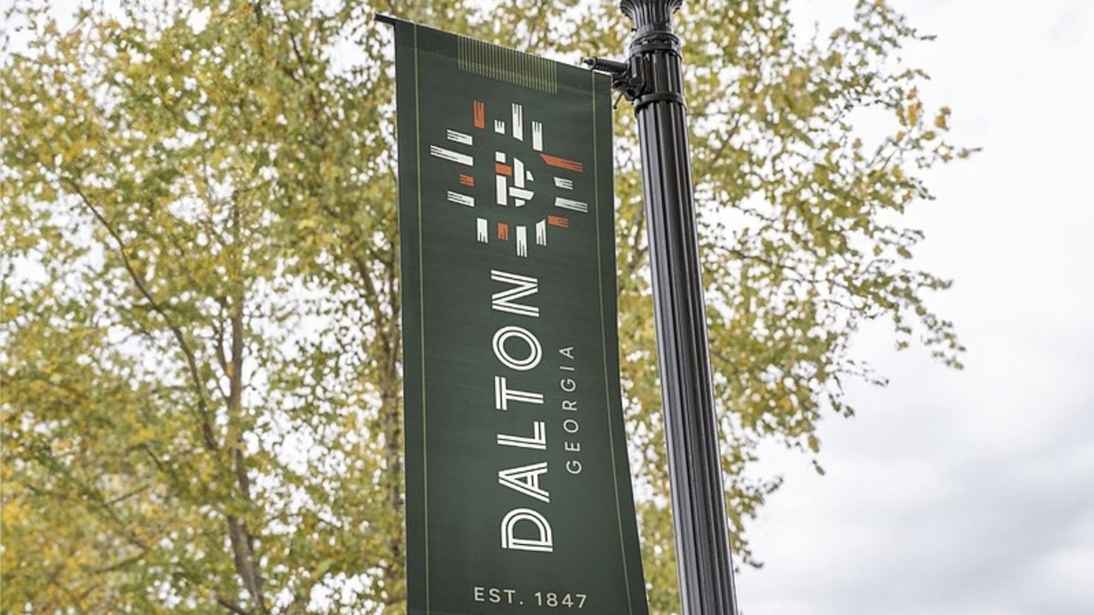
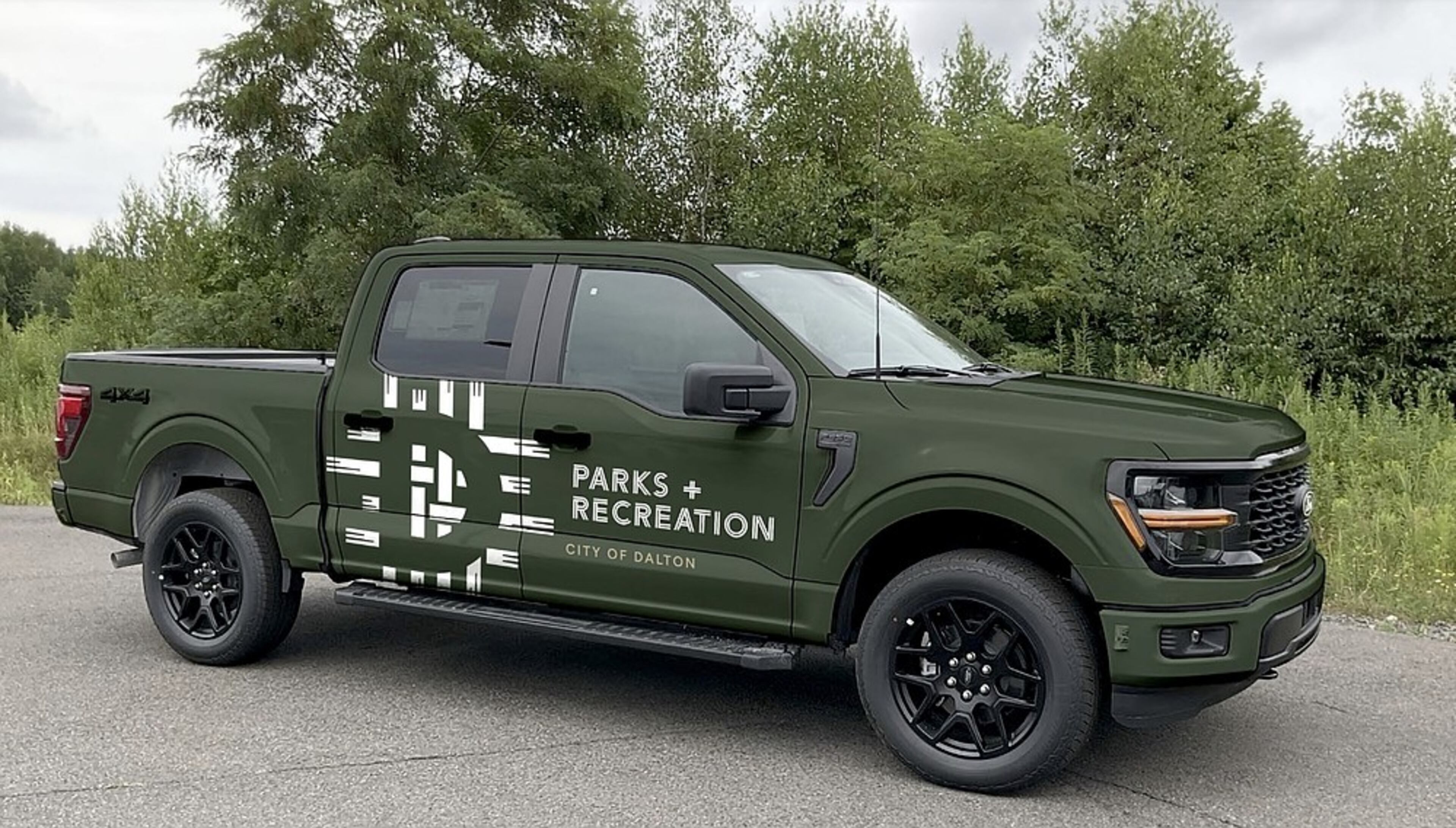
The new logo, with its dark green tone and orange, white and green accents, was developed with influence from citizen voices.
A logo committee comprised of citizen representatives viewed different options while steering the development of Dalton’s new city branding, Frazier said.
One of those voices was Allyson Coker, the executive director of Believe Greater Dalton, which she said is the community strategic plan led by the Greater Dalton Chamber of Commerce.
Via phone, Coker said the outdated logo did not represent Dalton as it is today, a city that has expanded beyond the carpet industry into flooring and is diverse, with a large, Hispanic population.
Though the city is historically traditional in the way it approaches things, Coker said it has evolved over the past several decades.
“It was time for something fresh and new that really was a better description of who we are as a community today,” she said.

Coker said she enjoys the simplicity of the logo and sees the looping fabrics as representing both its textile legacy and the threads of its diverse community.
“Any time you try to change a branding that, you know, has been around a long time, it’s never an easy process,” she said about the committee’s united agreement on the new logo design.
One of the greatest focuses for Believe Greater Dalton is to consider how the strategic plan does a better job of telling the story of the community within Dalton, she said.
The updated branding captures the essence of that story, Coker said.
“What was chosen, I think, is a better way to reflect who we are as a community and how we tell that story,” she said.
The design
Todd Vaught, the principal at Confluence Design, said via phone that designing a logo is a long process of discovery with the city.
“We don’t know the history of Dalton, and nor do we know the history of any place or business that we do branding for,” he said.
Vaught said the team at Confluence, based in Decatur, Georgia, has to get involved and spend a significant amount of time learning about a place’s history, its people and what makes a city unique, real and authentic.
“The process of getting there involves a lot of research, a lot of discovery, a lot of spending time with people there and having dialogue,” he said. “And talking about the history and how Dalton became what it is and where they want to go and how they’ve evolved and are changing.”
Those conversations usually involve a committee with a cross section of people to represent the community, he said. These individuals should be diverse in terms of demographics like race or gender.
Confluence puts together both questions and talking points to start dialogue among the members, Vaught said.
“It’s more conversational, right?” he said. “You’re just trying to get people to talk about what they think and feel about the city.”
The symbolism behind the logo is succinct, he said. The strength of the community and the textile mills are portrayed in the fabric of the logo.
Like a city that comes out of its community, Vaught said the “D” in Dalton’s logo is placed in the center, coming out of the threads.
“I think it’s gonna be a strong brand position for the city to use moving forward,” he said of the logo.
New city branding may take a while for people to adjust to after seeing it for the first time, Frazier said, but he hopes the people of Dalton like the finished product. And he hopes it will become recognizable as it grows on them.
“I think that this is a really beautiful concept, and I think that as people get used to it, I think it’s going to be something that’ll be symbolic of Dalton for a long time, hopefully.”

MEET OUR PARTNER
Today’s story comes from our partner Chattanooga Times Free Press, which serves readers in Southeast Tennessee, Northwest Georgia and Northeast Alabama. Visit them at timesfreepress.com or on Twitter @TimesFreePress.
If you have any feedback or questions about our partnerships, you can contact Senior Manager of Partnerships Nicole Williams via email at nicole.williams@ajc.com.

