Here’s how to use bold colors, according to Atlanta’s top interior designers

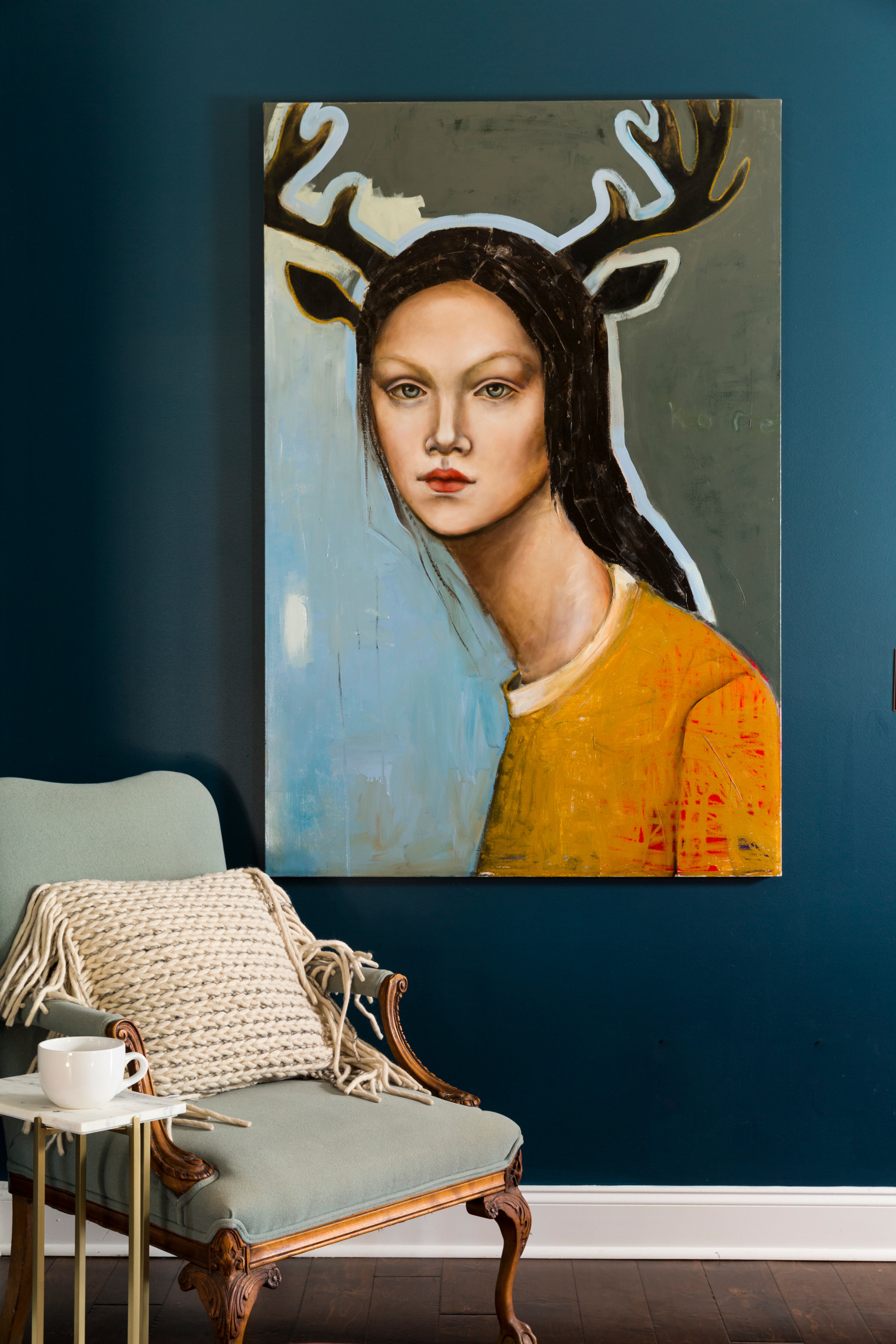

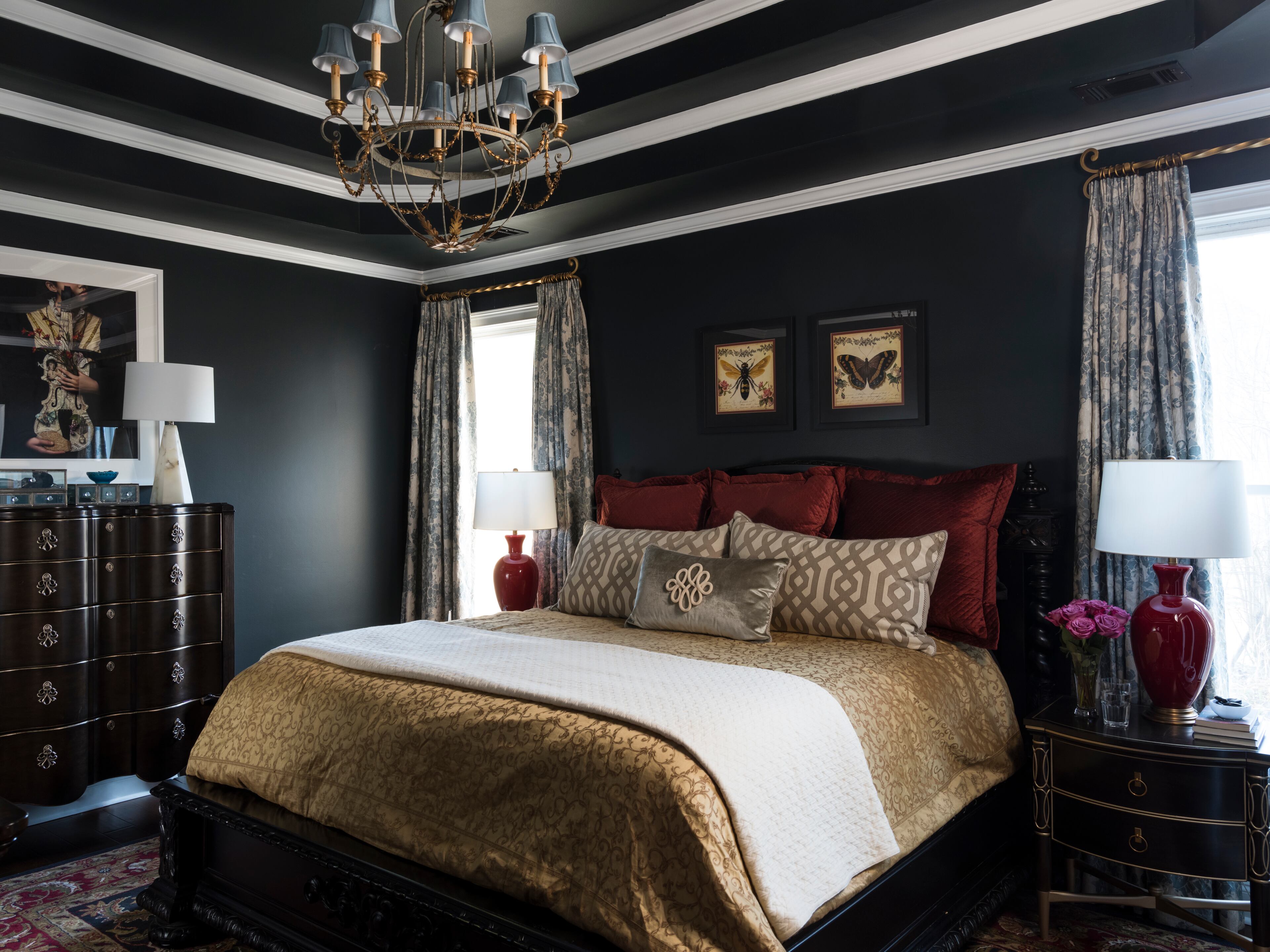
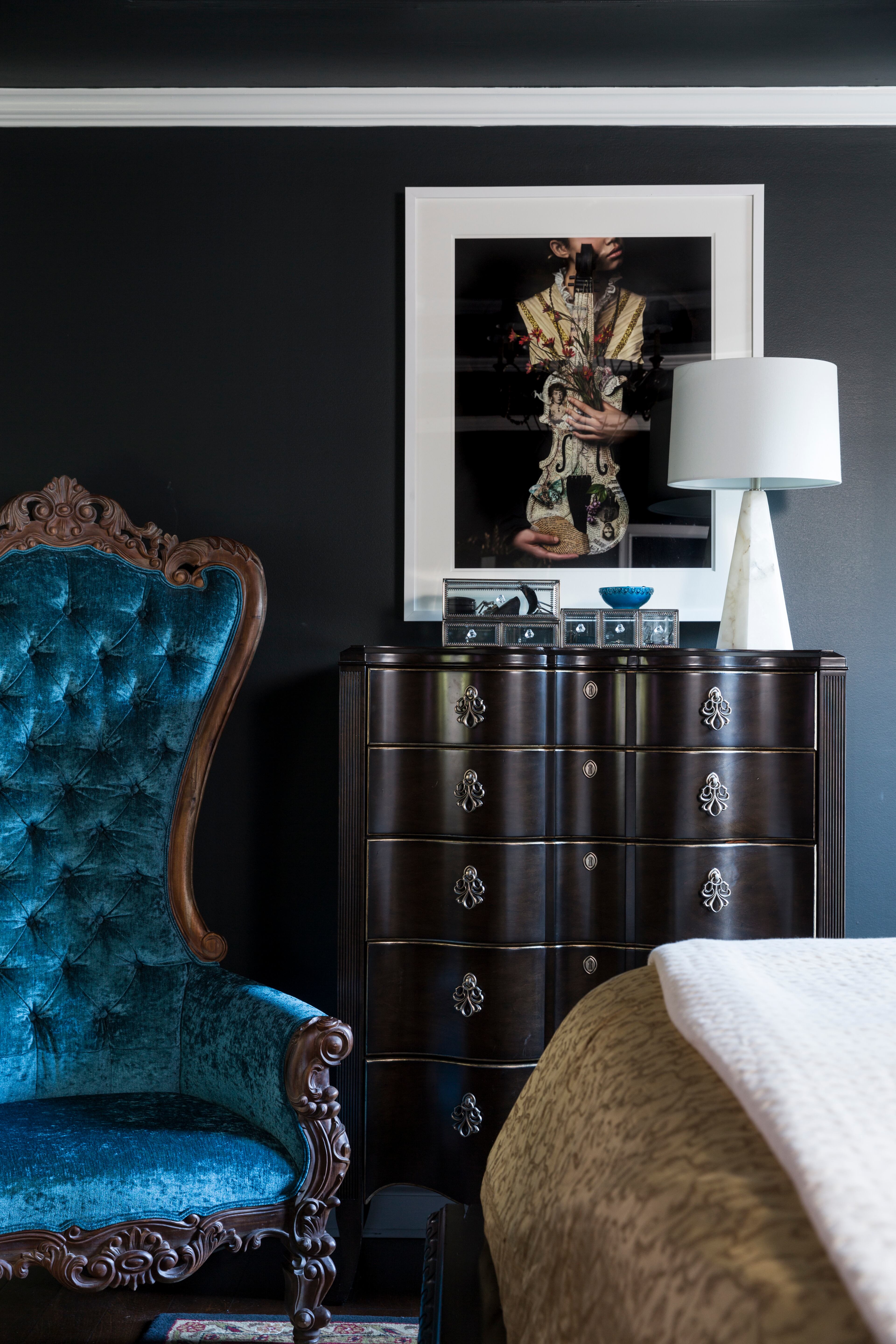

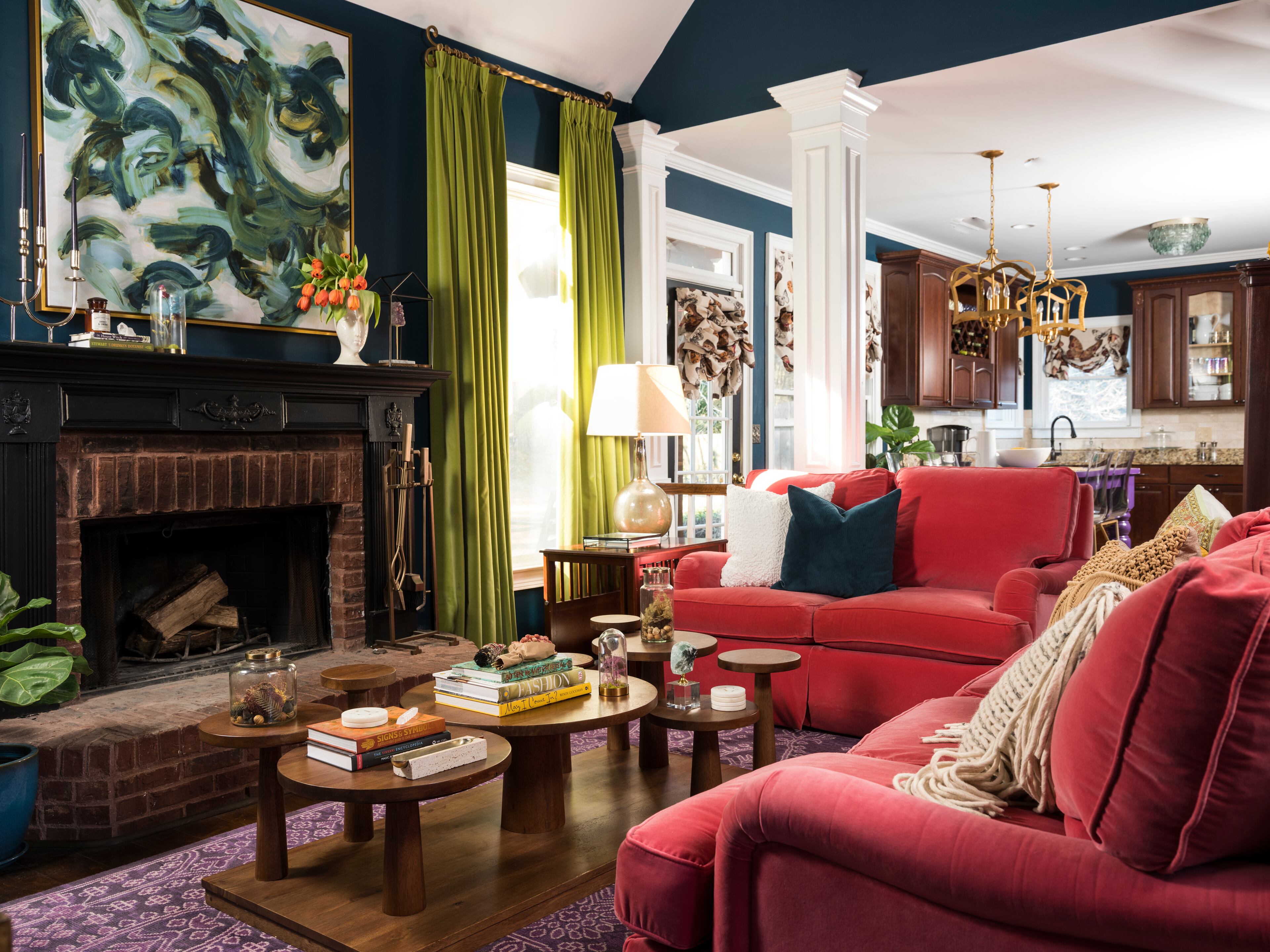


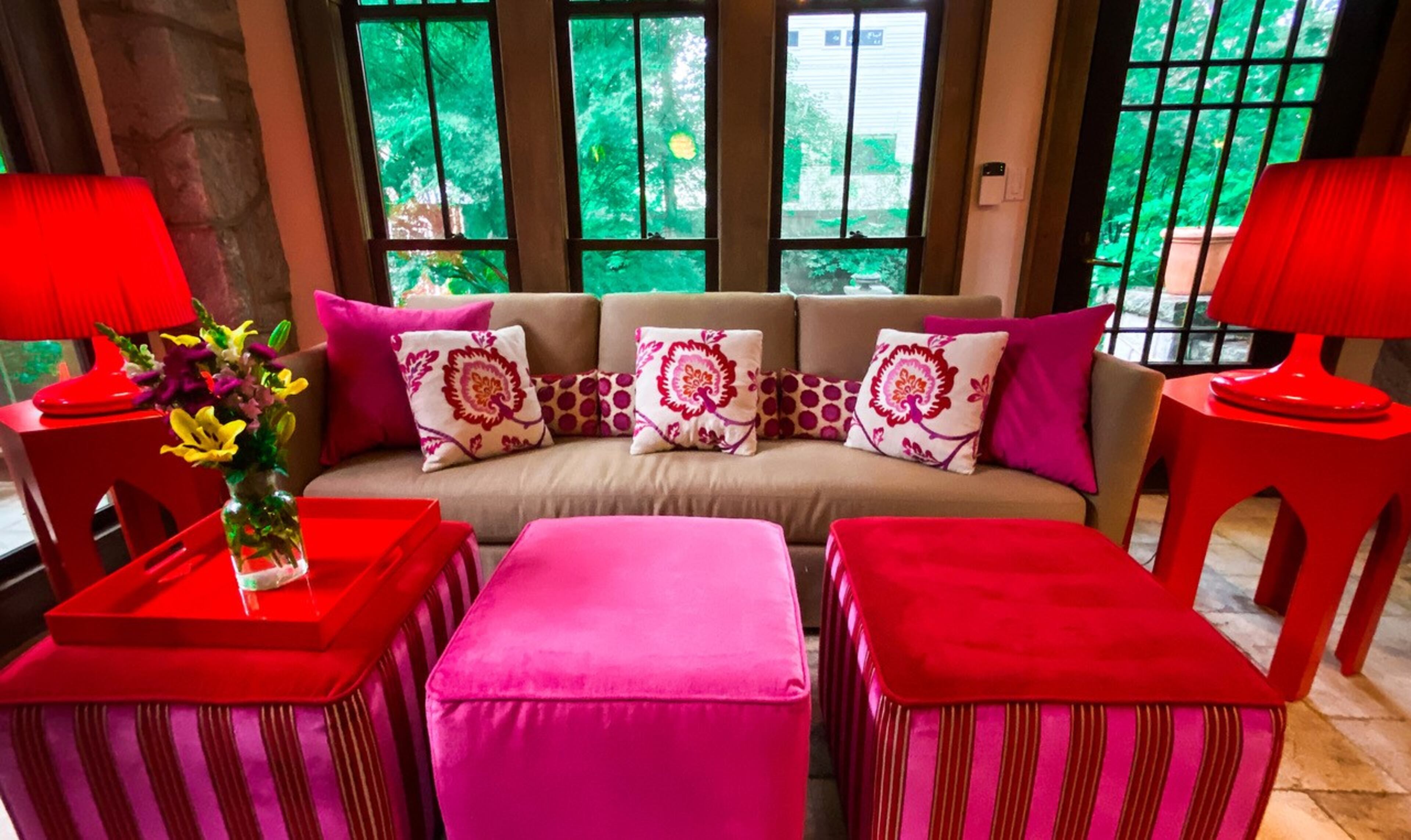


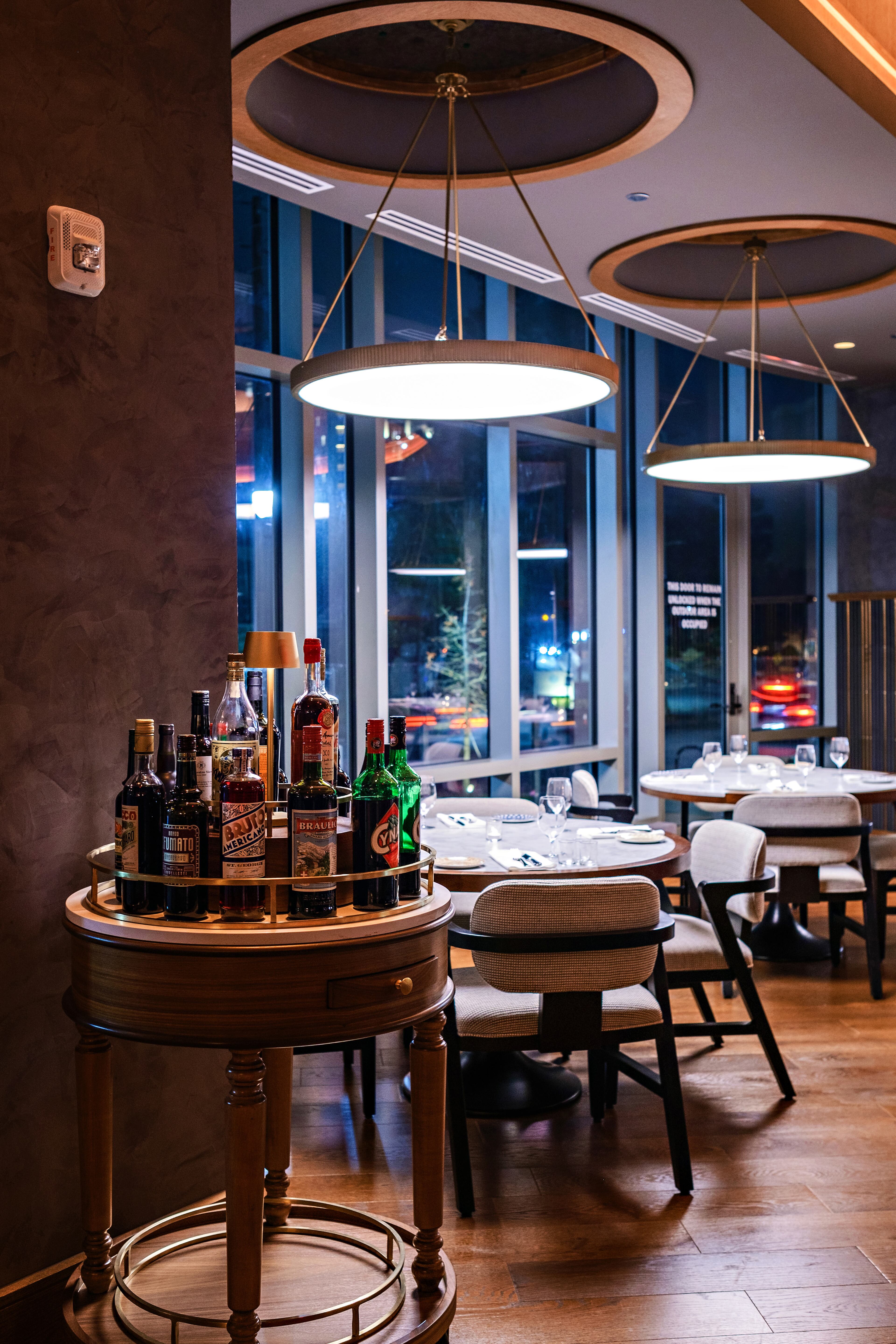


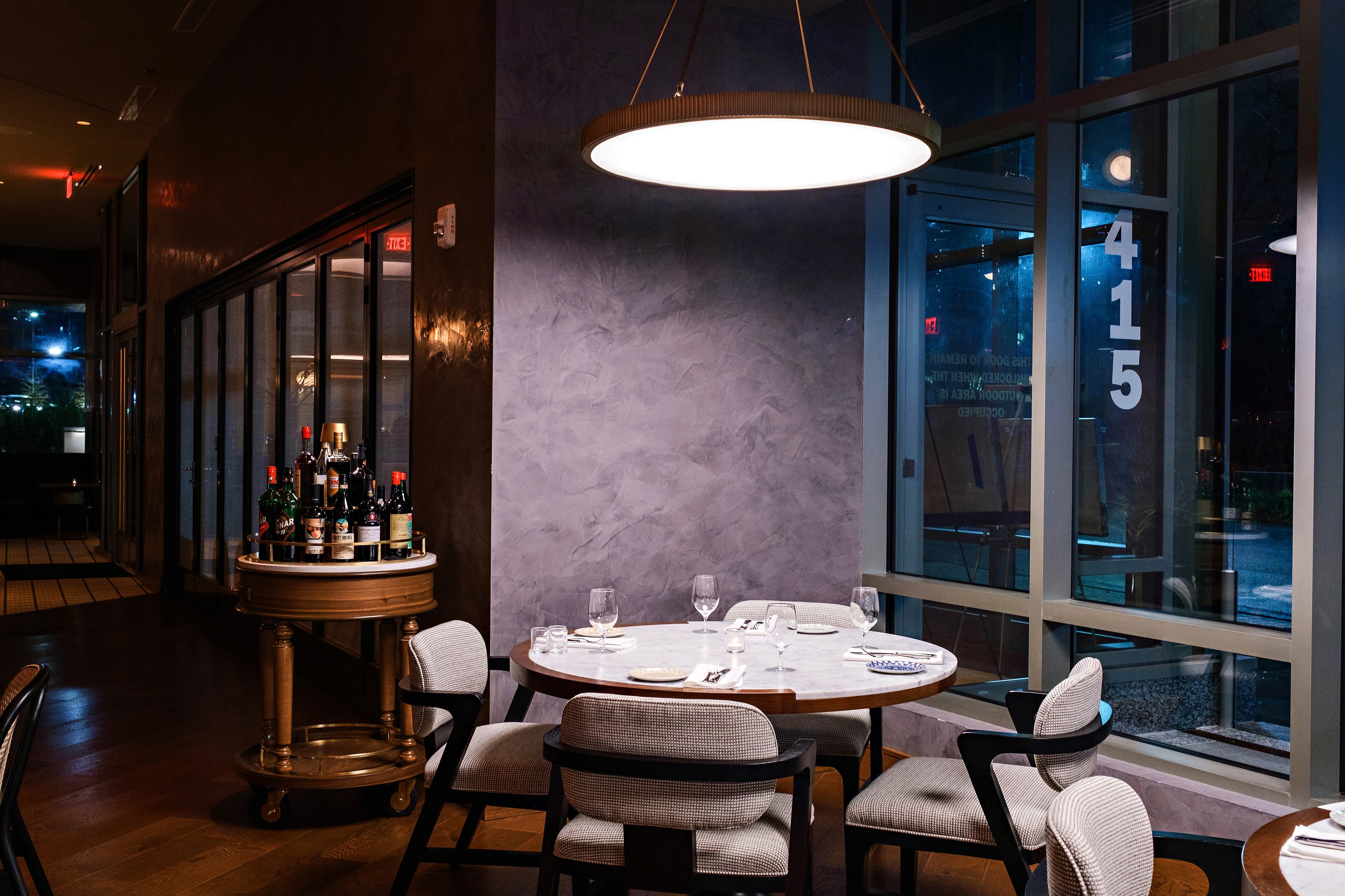


While trends come and go, there is one interior design choice that has spread at an exceptional pace this year — bold colors. After living with the pandemic for years, many homeowners are feeling isolated and are consequently focusing more on their mental health. A great way to reinforce a brighter mindset, according to Atlanta’s top interior designers, is by going bold.
Atlanta’s Lauren Wesley Designs said the uptick in bold color choices is due to a number of other factors as well.
“Going bold with color is so popular this year because for the past two or three years the design trend has been very focused on the minimalist and modern farmhouse aesthetics which typically encompass more muted and neutral tones, such as whites and grays,” the studio told The Atlanta Journal-Constitution. “Also, I think people are getting a little restless after being stuck inside during the pandemic. It’s time to inject some excitement into our environment and fall is the perfect time to do that.”
Studio 11 Design agreed.
“Like fashion, design trends are often cyclical,” the studio said. “Warm neutrals, earth tones and Scandinavian-inspired elements have dominated the design scene in recent years. While these are still popular choices, people are ready for a shift and are looking to brighten their homes and update their aesthetic in simple, yet impactful ways, easily done through the use of bold color.”

For those designing their own living spaces, the pros warned that there are some common pitfalls to look out for.
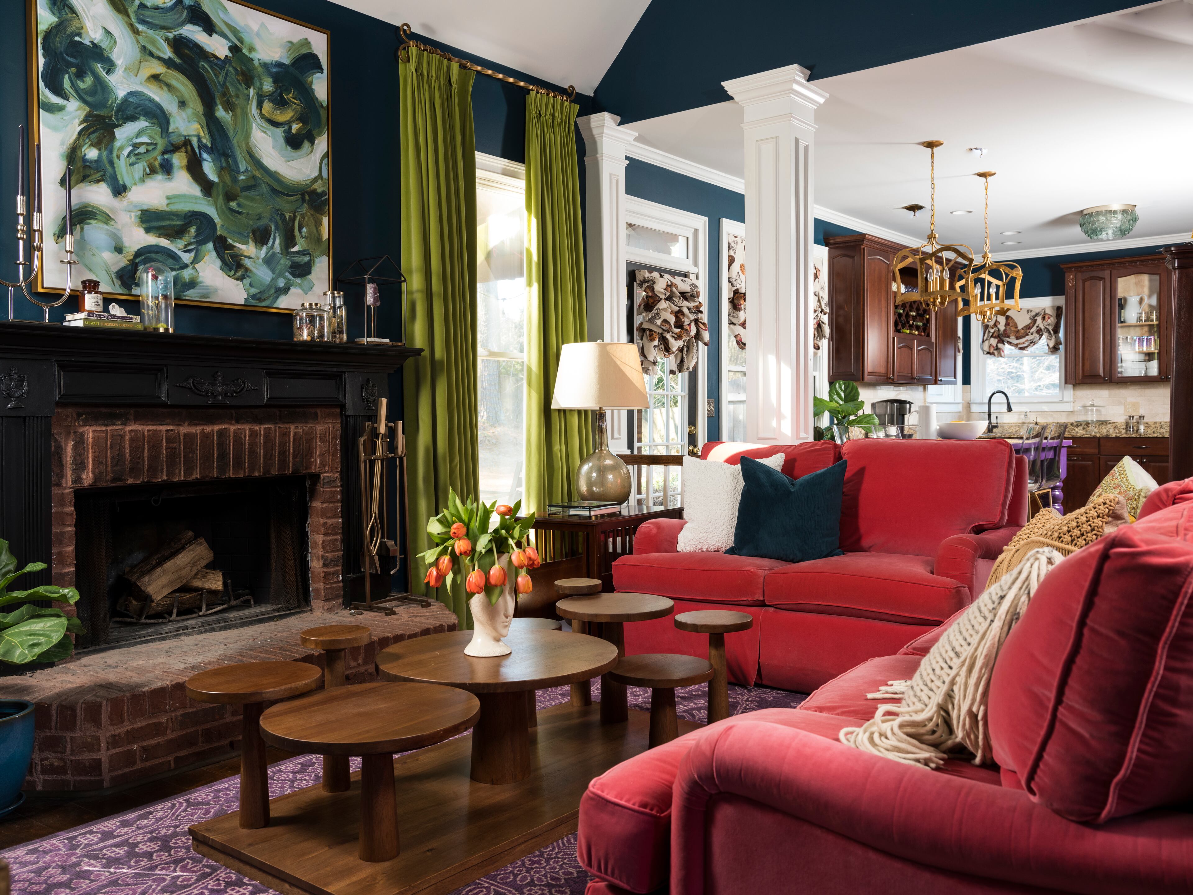
“The most common mistake that I see happening is featuring an accent wall,” Lauren Wesley Design said. “Frankly, we are tired of accent walls. If you must do an accent wall, include some millwork and a color over the millwork. Even still, we like to go ahead and commit to a color that we would feel comfortable with placing on every wall. When working with a bold color, you don’t have to go bold all over. You can go bold with your window treatments, a beautiful or a patterned rug. We like incorporating neutral furniture with bold accents. The combination of a bold color and neutral furniture gives so much more versatility to the room.”
CG Interiors, on the other hand, warned that people often don’t go bold enough.
“I’d say not going bold enough, like settling for just a pop of color here and there,” the studio said. “If you’ve done your research, you’ll know what schemes make you happy. Don’t be afraid to change things up.”
Leah Atkins Design cautions against going too bright with the paint selection.
“One common mistake is having an entirely neutral room and just throwing in a couple of bold colored accessories — this can be done well, but it can also look like a cheap afterthought,” the studio said. “Another mistake is choosing the wrong paint color, whether it’s not bold enough or too bold. Typically, you want the color to be deep, but not bright (this will keep it from looking like a kid’s room).”
While it’s good to know where some novice designers go wrong, it’s more important to know what can go right.
Lauren Wesley Design said that accent items are the way to go if you want to improve your space.
“Implementing bold colors using accent pillows, art, rugs, and window treatments can really add character and dimension to a room,” the studio said. “When there are too many colors it takes the eye all over and can often make people feel a little uneasy. You would be surprised how much design and color affects mood and comfortability.”
Andi Morse Design suggested focusing on a single color rather than a spectrum of bold choices.
“I love the idea of taking one color and going BIG with it,” they said. “Use it on furniture, walls, and fabrics to create a monochromatic look. I also love the idea of sprinkling strong or unexpected colors into a room for a surprise when you walk through the door.”
Studio 11 Design said contrasting the walls from the room’s furnishings can really create a pop.
“Bold wall colors are an excellent way to make a statement,” the studio said. “They lend a dramatic effect that immediately wows guests, and can easily be softened by neutral furniture pieces and accessories.
“If a bold wall color feels like too big of a commitment, I also love using bold colors with either a statement furniture piece, like a sofa, or in smaller more supporting accent pieces, like throw pillows, rugs and artwork. In the former, the larger piece becomes an artistic focal point and can be balanced by softer accessorizing elements. In the latter, accessories have the ability to brighten a neutrally toned room, adding artful pops of color that can easily be swapped out when a change of aesthetic is desired.”

If you are looking for inspiration when it comes to choosing a specific color scheme, there are a few trends to consider.
Andi Morse Design said green is in vogue this year.
“If you’re into ‘grandmother chic,’ then color is a great choice for mixing and matching within your walls,” they said. “Not only mixing solids, but patterns with bold neutrals. Green is a big color this year and there are so many deep hues that are easy to bring into your home through paint, fabric, and even wallpaper. Many times homeowners are worried they will tire of a color so are too afraid to commit. If that’s the case, I recommend starting small by mixing in throw pillows or statement lamps. As you start to feel more comfortable with the color, you’ll likely start infusing it more.”
CG Interiors said that it is alright to buck the trends as well.
“My advice is not to follow or give in to trends,” they said. “Trends in design come from such myriad places, and tend to categorize rather than emphasize individuality. Choose colors that resonate personally; that bring you joy, or settle your soul — whatever the emotion is that you are trying to evoke.
“Often when designing a home with a lot of color, we’ll treat the bedroom as more of a neutral zone, engendering a sense of calm when clients settle in.”

