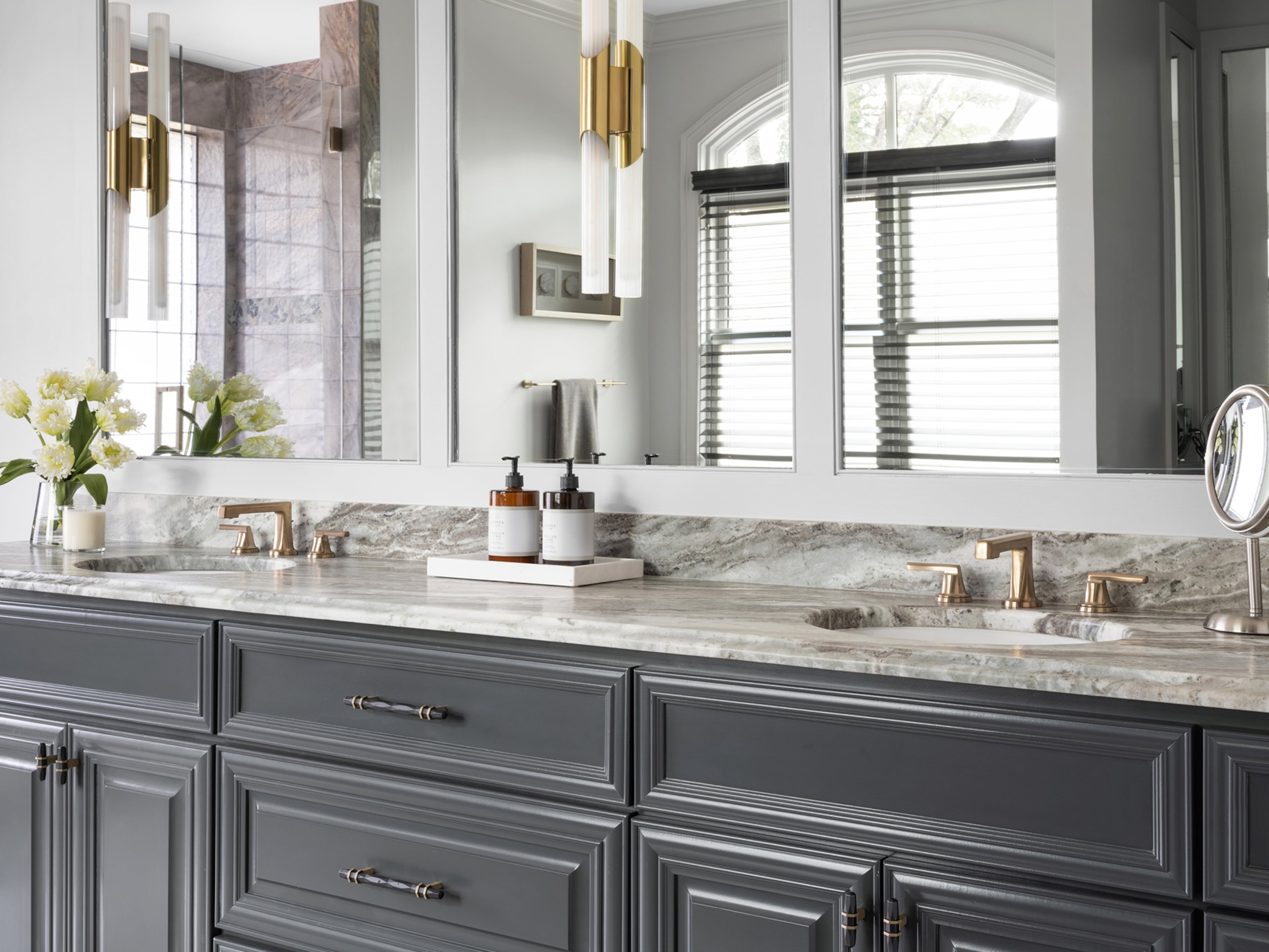
Interior designers have pet peeves, too: Here are the trends that tire them

There is no denying that trends are as present in interior design as they are in fashion or food.
Styles come and go, and sometimes it’s hard for homeowners to know what will be the popcorn ceilings and linoleum floors of tomorrow.
But interior designers are in the design trenches. As a result, they are often the first ones to see when a trend is coming dangerously close to being overplayed or when something that once looked rare and chic is now ubiquitous.
Designer Phoebe Howard, who has offices in Atlanta, Jacksonville and Charlotte, ticks off a list of overused interior design features she’d like to see less of: sunburst mirrors, curved sofas and framed intaglios, or engraved prints.
She’s not the only one with a list of design pet peeves.
Here are three Atlanta-based interior designers, weighing in on trends they see as nearing their sell-by date and then offering up alternatives.
Erika Hollinshead Ward
Too much farmhouse
“The home that’s completely done in the farmhouse style feels appropriate on a farm, but misplaced in the middle of the city,” said Ward of Erika Ward Interiors.
Try this instead: Use shiplap paneling, or long wood planks, on just one accent wall for more dramatic impact.
Cold gray interiors
“I feel like warm whites and beiges and anything that shows signs of life is kind of what we need right now to boost our moods,” Ward said.
Try this instead: If you absolutely love gray, add warm metallic accents to breathe life back into a room.

Too much glam
“Overly glam spaces — I just think they look cheap,” Ward said. “And you have so many reflective surfaces that … it starts to feel like a funhouse.”
Try this instead: Keep the sparkle and glamour in a room through lighting and possibly a couple of accent chairs.
All-white interiors
“They feel sterile, unapproachable, and they’re difficult to maintain,” Ward said. “Your house ends up feeling like a museum.”
Try this instead: Paint your walls white but add bold color, like large-scale artwork.

Amber Guyton
All neutrals
“I’m over the Restoration Hardware all black, white and beige look. This trend isn’t practical for most households and lacks character and visual interest,” said Guyton of Blessed Little Bungalow.
Try this instead: Don’t be afraid to add subtle pops of color to mix in with the neutrals, creating contrast and vibrancy.
Functionless knickknacks
“When accessorizing your space, skip the typical Tom Ford book and excessive knickknacks from HomeGoods that serve zero purpose,” Guyton said.
Try this instead: Add functional items, heirlooms, books, picture frames and items that are meaningful and provide inspiration. Accessorizing is a marathon, not a sprint. It’s OK to use different items over time on surfaces and bookshelves.

Michael Habachy
Shiny and new
“Everything doesn’t have to be perfect. I am trying my best to educate my clients that not everything has to be pristine, polished and brand new. Contemporary doesn’t equate to perfection,” said Habachy of Habachy Designs. “Embrace what is perfectly imperfect.”
Try this instead: Embrace the beauty of imperfections and the philosophy of wabi-sabi, a Japanese aesthetic of embracing imperfection and transience. For decorative lighting and plumbing fixtures, select unlacquered metals such as brass or bronze that age and take on a patina over time.
The ’80s resurgence
“I’m not a fan of the resurgence from the ’80s, particularly the Memphis design style from that period,” Habachy said. “I already lived through it once, and I didn’t really care for it even back then. I like incorporating bold statement pieces, but I do it with more restraint.”
Try this instead: Accent with two to three complementary colors, at most, in a space and combine them with neutrals. Bold shapes should be used in moderation and placed in a more balanced fashion.

Tile countertops
“This was a thing in the ’60s and ’70s and seems to have made a comeback,” Habachy said. “I don’t think this is ever a great idea because the grooves of the grout are the perfect opportunity for dirty residue to collect.”
Try this instead: Opt for natural stone countertops as a first choice. If budget is a factor, there are lots of options such as quartz, sintered stone and porcelain.

Shiplap
“Shiplap seems like the go-to for every spec builder out there. It’s clearly a simple and cost-effective solution,” Habachy said. “But in my opinion, it’s getting very tired.”
Try this instead: Other dimensional surfaces can add visual interest to walls such as reeded wall panels, slatted wood panels, textured wall coverings and applied moldings.

Felicia Feaster is a longtime lifestyle and design editor who spent 11 years covering gardening, interior design, trends and wellness for HGTV.com. Felicia is a contributor to MarthaStewart.com and has been interviewed as a design expert by The New York Times, Forbes and the Associated Press.

